
 By
By 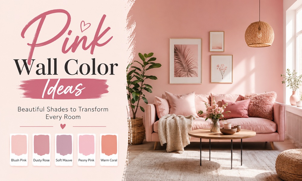
Pink is the most misread colour on any fan deck.
Gone are the days when pink wall paint was only for nurseries and little girls’ rooms. Designers now put it in kitchens, offices, mudrooms and living rooms — and call it a neutral while doing so.
The reason most people get pink wrong isn’t taste. It’s physics. Undertone, light reflectance value and window orientation decide what a pink actually looks like on your wall, and almost nobody checks all three.
This guide does the science first, then goes room by room.
Part 1 — The Three Variables That Decide Everything
Variable 1: Undertone
Like most paint colours, pinks can be warm or cool based on their undertones.
| Hidden pigment | Pink becomes | Behaves like |
|---|---|---|
| Yellow | Plaster, peach, apricot pink | A warm neutral |
| Orange | Terracotta, coral, salmon | An earth tone |
| Grey | Dusty, muted, chalky | A sophisticated neutral |
| Brown | Nude, rose-beige, taupe-pink | A true neutral |
| Purple | Mauve, lilac-pink | A cool accent |
| Blue | Bubblegum, fuchsia | A saturated colour |
The single most reliable rule in pink paint: yellow pigment makes pink liveable. Setting Plaster is a pink in historic terms, but has a certain softness to it due to the inclusion of yellow pigment. Pink Ground, with its large dose of yellow pigment, creates the softest blush of colour for a warm and soothing finish that doesn’t feel sugary.
Variable 2: Light Reflectance Value (LRV)
LRV is a percentage scale measuring how light or dark a paint colour is based on how much light it reflects. Zero is black; 100 is pure white. It helps predict what a colour will actually look like on the wall.
| LRV band | Effect | Use for |
|---|---|---|
| 75–85 | Reads almost white | Nurseries, small dark rooms, ceilings |
| 60–74 | Clearly pink but airy | Bedrooms, bathrooms |
| 48–65 | Whole-home neutral range | Living rooms, hallways, kitchens |
| 30–47 | Saturated, enveloping | Dining rooms, studies, powder rooms |
| Below 30 | Deep, dramatic | Feature walls, joinery, front doors |
The insight most guides miss: Setting Plaster sits at an LRV of about 56 — right in the same range as most whole-home neutral paint colours. Anything with an LRV between roughly 48 and 65 is what you see on the walls in most homes.
That is why plaster pink doesn’t read as “pink.” It reads as a wall.
Variable 3: Window Orientation
| Room faces | Light quality | What it does to pink | Pick |
|---|---|---|---|
| North | Cool, blue, indirect | Pushes pink toward lilac and grey | Warm, yellow-based pink |
| South | Bright, warm, abundant | Washes out pale pinks | Higher-pigment pink; lower LRV |
| East | Warm morning, cool afternoon | Shifts across the day | Mid-tone dusty pink |
| West | Cool morning, golden evening | Turns peachy at sunset | Grey-pink or mauve to balance |
A light warm pink with an LRV around 73 will look amazing in a north-facing room or a low-light room. In a room flooded with south-facing light, it may get washed out.
A pale pink with grey in it brings a serene vibe to spaces with a lot of natural light, but can appear more intense in a small space.
Part 2 — The Pink Paint Reference Table
Everything worth putting on a wall, sorted by how it behaves.
Plaster & Warm Pinks (The Neutrals)
| Colour | Brand | LRV (approx.) | Best for |
|---|---|---|---|
| Setting Plaster No. 231 | Farrow & Ball | ~56 | Bedrooms, kitchens, offices, mudrooms |
| Pink Ground No. 202 | Farrow & Ball | High | Living rooms, hallways |
| Boudoir | Benjamin Moore | ~56 | Setting Plaster alternative |
| Crossroads | Benjamin Moore | ~56 | Setting Plaster alternative, slightly pinker |
| Likeable Sand | Sherwin-Williams | ~55 | Warmer, deeper alternative |
| Classic Sand | Sherwin-Williams | ~55 | Closest SW match |
| Pinky Beige | Sherwin-Williams | Mid | Very earthy, bordering on terracotta |
| Coastal Cottage 1164 | Benjamin Moore | Mid-high | Soft, shrimp-like, European peachy pink |
Grey & Mauve Pinks (The Sophisticated Ones)
| Colour | Brand | Character |
|---|---|---|
| Calamine No. 230 | Farrow & Ball | A light touch of grey keeps it fresh, not sugary; intense in small rooms, delicate in large well-lit ones |
| Peignoir No. 286 | Farrow & Ball | Softest pink plus a big dose of grey; works in old and new homes; pairs with contemporary neutrals |
| Sulking Room Pink | Farrow & Ball | Sways to the mauve side; good for kids’ rooms and play spaces |
| Pink Shadow | Sherwin-Williams | Soft and subtle; sophisticated enough that a child won’t outgrow it |
| First Light 2102-70 | Benjamin Moore | Almost weightless brownish-pink |
Deep & Saturated Pinks (The Statements)
| Colour | Brand | Character |
|---|---|---|
| Smoked Trout | Farrow & Ball | Incredibly saturated, rich pink neutral; vibrant but not overpowering; beautiful against white trim; suits an office or bedroom |
| Dead Salmon | Farrow & Ball | Beige undertones; a calm neutral for anyone not ready to fully commit to pink |
| Cuisse de Nymphe Emue | Farrow & Ball | Dusty pink with enough umber to avoid sugariness; flattering in bathrooms |
| Malted Milk | Sherwin-Williams | Warm, elegant, romantic |
| Mellow Coral | Sherwin-Williams | Subdued creamy coral with peachy undertones; a statement for living rooms and bedrooms |
| Coral Dust | Benjamin Moore | Medium, muted pink with warmth; good with aqua, yellow, or black-and-white; whimsical as a front door |
| Resounding Rose | Sherwin-Williams | Dusty rose with brown in it; matches vintage bathroom tile |
Whisper Pinks (Almost White)
| Colour | Brand | LRV | Character |
|---|---|---|---|
| Pink Cloud | Benjamin Moore | ~80 | Sweet ballet-slipper pink; lovely in a nursery |
| Head Over Heels | Benjamin Moore | ~73 | Light, lovely warm pink; strong in north-facing rooms |
| Dimity | Farrow & Ball | High | Very light warm pinkish white |
| White Dogwood | Sherwin-Williams | High | Soft, feminine blush |
| Soft Stone | Farrow & Ball | High | Flattering with warming yellow undertones; makes a large bathroom feel cosier |
Part 3 — Pink Wall Colour, Room by Room
The Living Room
Target LRV: 50–65. You want a colour that behaves like a neutral across a whole day.
Choose: Pink Ground, Setting Plaster, Likeable Sand, Mellow Coral (for a bolder scheme).
Pair with: Burgundy, forest green, walnut, black-and-white photography, brass.
A burgundy sofa against a Calamine feature wall works beautifully — pinks and deep reds are natural relatives, not enemies.
Avoid: Cool grey furniture. It fights every warm pink.
The Bedroom
Target LRV: 55–73.
Choose: Setting Plaster, Peignoir, Pink Shadow, Head Over Heels.
Setting Plaster in a primary bedroom reads to some people as taupe and to others as pink — that ambiguity is precisely why it works. Paired with a crisp white ceiling and trim it looks lighter in the room than on the swatch.
Pair with: Warm woods such as cherry or mahogany. Linen, wool, brass, cream.
Insider tip: Consider a pink ceiling. Setting Plaster overhead gives a bedroom a permanent golden-hour quality without touching the walls.
The Bathroom
Target LRV: 55–75.
Choose: Cuisse de Nymphe Emue, Soft Stone, Calamine, Setting Plaster.
The functional argument for pink in a bathroom is the strongest of any room: the warmth of the colour amplifies the radiance of your skin, so it is wonderfully flattering.
In a large bathroom, a warm pink with yellow undertones on walls and panelling makes the space feel cosier.
The Kitchen
Target LRV: 50–65 for walls; anything for cabinetry.
One documented kitchen used Setting Plaster on the walls with cool, earthy Carrara marble counters and very light pinkish-white cabinets.
Pair with: Carrara, brass, white oak, sage green, chocolate brown.
Avoid: Grey quartz with blue undertones. It makes warm pink look dirty.
The Nursery
Target LRV: 73–85.
Choose: Pink Cloud, Head Over Heels, Dimity.
A light warm pink is ideal for any nursery, and colour-drenching the room with a single matte sheen across all surfaces works well.
Note: consider a pink your child will still like at eight. A grey-softened pink is sophisticated enough that a young client won’t outgrow it.
The Home Office / Study
Target LRV: 30–50. Go darker than instinct suggests.
Choose: Smoked Trout, Sulking Room Pink, Peignoir.
Smoked Trout is saturated and rich, vibrant without overpowering, and contrasts beautifully against white or off-white trims — an excellent office colour. Peignoir works on walls and millwork in different sheens, including in offices.
The Hallway, Mudroom and Small Utility Spaces
Choose: Setting Plaster, Dead Salmon.
Setting Plaster is used liberally as a “neutral-with-a-twist” across bathrooms, studies and mudrooms. These are the rooms where a warm pink does its quietest, best work — you pass through and register warmth, not colour.
The Dining Room
Target LRV: 30–50.
Choose: Smoked Trout, Sulking Room Pink, a deep dusty rose.
Dining rooms are used at night. Deep pinks under warm bulbs are extraordinarily flattering to both food and faces. This is the single most under-used pink application in residential design.
The Front Door and Exterior
Coral Dust is a beautiful and whimsical choice for a front door. Setting Plaster would make a really amazing front door too — though exterior pink siding is a serious commitment and a serious paint bill.
Part 4 — What to Pair With Pink Walls
Trim, Ceiling and Woodwork
Consider clean whites and off-whites: Benjamin Moore Chantilly Lace, Oxford White or Cloud White. Use flat paint for the ceiling and satin or semi-gloss for trim.
Alternatively, rather than contrasting with a bright white, try a warmer off-white on the woodwork for a softer, more unified look.
Do not use overly creamy whites, which look dingy paired with plaster pink.
Companion Colours
| Companion | Effect | Example |
|---|---|---|
| Muted blue | Cools and steadies | BM Britannia Blue |
| Blue-green | Fresh contrast | BM Raindance |
| Sage / grey-green | Sophisticated calm | SW Evergreen Fog |
| Warm grey-green | Subtle contrast on cabinets | BM Chelsea Gray |
| Deep red / burgundy | Rich, historic | Deep reds with subtle pinks |
| Warm beige | Tonal, quiet | BM Manchester Tan |
What to Avoid
Yellows can look discordant if they are too light. If you have too many pastel colours together, the combination can end up looking like an Easter egg — and not in a good way. Pick mid-toned rich colours to pair with pink instead.
Part 5 — Getting It Right the First Time
The Sampling Protocol
Most pink regret is a sampling failure, not a colour failure.
- Never use a paper chip. Chips are printed, not painted, and are too small to read.
- Use two coats of real paint on a large sample board, or a peel-and-stick sample made with real paint.
- Mount samples on white poster board, not directly on your existing wall colour, which contaminates the read.
- Move the board around the room at 9am, 1pm, 5pm and at night under artificial light.
- Check it against your fixed elements — your floor, your countertop, your sofa. Not against a Pinterest image.
Testing the colour in your home, in natural light, is the most important step in choosing a paint colour.
Sheen Guide
| Surface | Sheen |
|---|---|
| Ceiling | Flat |
| Walls (general) | Matte or eggshell |
| Walls (bathroom, kitchen) | Eggshell or satin |
| Trim and doors | Satin or semi-gloss |
| Colour-drenched room | One sheen throughout — matte works very well |
Coverage Reality
Deeply pigmented pinks cover better than you’d expect. Two coats over a mid-LRV existing colour is often sufficient, and some users report needing around 30% less paint than the manufacturer estimates with heavily pigmented brands. Always prime over a strong existing colour.
What Do People Actually Say After Living With Pink Walls?
Recurring notes from Reddit (r/InteriorDesign, r/HomeImprovement, r/Frugal), Quora paint threads and long-form Medium home diaries:
- Household members disagree about whether it’s pink at all. This is the recurring comedy of plaster pinks. One documented case: the husband calls it taupe, the wife calls it pink. Both are looking at Setting Plaster. This ambiguity is the reason it works.
- North-facing pink turns lilac. The most common complaint by a wide margin, and the most preventable.
- People underestimate how much light a room gets. A pink chosen from a swatch in a south-facing showroom will look completely different in a hallway.
- Sample discipline is the recurring advice. Buyers who sampled properly report near-zero regret. Buyers who ordered from a photo report high regret.
- “I painted the ceiling too and it changed everything.” Colour-drenching appears repeatedly as the move people wish they’d made from the start.
Frequently Asked Questions
What is the best pink wall colour? For most rooms, a warm plaster pink with an LRV in the 50s. Setting Plaster is warm, earthy, with orange undertones — light enough to keep a space bright but with plenty of pigment. It reads as organic and historic rather than as a baby hue, so it works in mature applications.
Is pink a neutral colour? In its plaster and dusty forms, functionally yes. A pink-beige at LRV 56 sits in the same range as most whole-home neutrals, and designers use it as a “neutral-with-a-twist” across bathrooms, studies and mudrooms.
Do pink walls make a room look smaller? Depends on LRV, not on hue. A pink above LRV 70 opens a room like an off-white. A pink below LRV 40 encloses it. A pale grey-pink can appear more intense in a small space — sample generously.
What’s the difference between blush, dusty pink and mauve? Blush is a clean, light pink. Dusty pink has grey or brown in it. Mauve has purple in it. They behave completely differently under artificial light.
Can you use pink in a masculine or gender-neutral room? Yes, and it’s routine in professional interiors. Drop the LRV, add grey or umber, and pair with dark wood and black metal. A saturated pink neutral against white trim reads as an office colour, not a bedroom one.
Does pink paint work with wood floors? Exceptionally well with warm woods. Plaster pink is beautiful paired with cherry or mahogany. With cool grey-toned floors it struggles — choose a grey-pink instead of a warm one.
How do I match a pink to something existing (tile, fabric, brick)? Take the object to the paint counter for a colour match, then sample the match and the two nearest shades. Guessing from memory produces samples that come back “totally off.”








Comments