
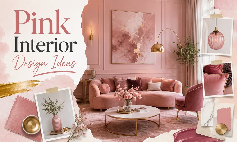
Tag: Pink Interior Design Ideas

  • Pink Interior Design Ideas for a Stylish and Beautiful Home

    Pink Interior Design Ideas for a Stylish and Beautiful Home

    Pink has quietly grown up. The sugary, tween-bedroom version is gone. In its place sits a warm, sophisticated color that designers now reach for the way they once reached for beige.

    This guide covers everything you need to decorate with pink well: the psychology behind it, the exact shades designers trust, room-by-room ideas, the colors that pair with it, and the mistakes that make pink look dated. You will also find a few insights most articles skip, including the strange science of “calming pink” and what pink really does to home resale value.

    Why Is Pink Making a Comeback in Interior Design?

    Pink is having a genuine moment, and it is not the same pink from a decade ago.

    The shade many people remember is “millennial pink,” the soft, slightly muddy rose that took over cafes and Instagram feeds. Benjamin Moore’s color team describes it now less as a fad and more as a permanent player in the modern color palette, prized for its warmth and easy versatility.

    The current direction is earthier and calmer. Sherwin-Williams color experts point out that the saturated, sweet pinks have faded in favor of blush, coral, and “pinky-neutral” tones that read as timeless rather than trendy.

    Two signals tell you pink is more than a passing trend:

    • IKEA named a pink its Color of the Year. The Swedish retailer calls its “Rebel Pink” a “new neutral” that adds energy while keeping to simple Scandinavian roots. When a mass-market brand bets a whole collection on a color, it usually reflects a durable shift, not a quick fad.
    • Designers now call pink a neutral. Several pink paint shades, especially the plaster and gray-toned ones, behave almost like off-white. They soften a room without demanding attention.

    Unique context most articles miss: pink was not always “feminine.” Until the early 20th century, many retailers marketed pink as a strong color suited to boys, and pale blue as delicate and suited to girls. The pink-for-girls rule only locked in after mid-century advertising campaigns. Knowing this makes it easier to see pink as what it really is: a warm, flexible hue with no fixed gender.

    What Does Pink Actually Do to a Room? The Psychology of Pink

    Color shapes mood, and pink is one of the more interesting cases.

    In most Western settings, pink reads as calm, warm, and non-threatening. Color psychologists connect soft pinks with feelings of comfort, safety, and nurturing, which is why blush tones show up so often in bedrooms, nurseries, and wellness spaces. Brighter pinks do the opposite: they add energy and playfulness, which suits dining rooms, creative studios, and social spaces.

    A useful way to think about it:

    • Soft, muted pink = restful, intimate, cocooning. Good for bedrooms and reading nooks.
    • Warm coral or salmon pink = cheerful and social. Good for kitchens and dining areas.
    • Hot or fuchsia pink = bold and stimulating. Best as an accent or in rooms with plenty of light.

    The strange science of “calming pink”

    Here is the insight most pink decor articles leave out.

    In the late 1970s, a researcher named Alexander Schauss tested a specific bright shade, later called Baker-Miller pink (also nicknamed “drunk tank pink”), on people in a correctional facility. Early reports claimed it reduced aggression and lowered heart rate within minutes. The idea spread fast, and versions of the color ended up in holding cells, hospitals, and even opposing-team locker rooms. More recently, one celebrity famously painted a living-room wall in the shade after hearing it could calm you and curb appetite.

    The honest footnote: later studies were mixed. Most researchers found any calming effect was short-lived, lasting roughly 15 to 30 minutes, and some subjects grew more agitated after longer exposure. So pink can feel soothing, but do not expect a single wall color to rewire your nervous system. For a home, the practical takeaway is simpler: warm, soft pinks tend to feel gentle and welcoming, and that is reason enough to use them.

    What Are the Best Pink Paint Colors for Interiors?

    The single biggest factor in a successful pink room is the shade. Get the undertone right and pink looks expensive. Get it wrong and it looks like a nursery.

    Designers overwhelmingly favor muted, earthy pinks with brown, gray, or yellow undertones. These “dirty” pinks behave like neutrals and shift beautifully with the light.

    Here are the pink paint colors interior designers name most often, organized by depth so you can match one to your room.

    Paint color Brand Vibe / undertone Best used in
    Setting Plaster (No. 231) Farrow & Ball Barely-there, yellow undertone, near-neutral Living rooms, whole-room color
    Peignoir Farrow & Ball Pink-gray, reads almost off-white Trim, joinery, layered schemes
    Pink Ground Farrow & Ball Dusty, warm, gentle Bedrooms, cozy living rooms
    Sulking Room Pink (No. 295) Farrow & Ball Deep dusty rose / mauve Dining rooms, moody spaces
    Dead Salmon Farrow & Ball Warm, chameleon salmon Any room, small woodwork
    Tissue Pink (1163) Benjamin Moore Blush meets beige, “grown-up ballet pink” Powder rooms, bedrooms
    First Light (2102-70) Benjamin Moore Soft blush, past Color of the Year Living rooms, accent walls
    Romance Sherwin-Williams Warm earthy light pink Bedrooms, calming spaces
    Pink Shadow (SW 0700) Sherwin-Williams Ethereal, airy blush Home offices, bathrooms
    Muddy Rose (DE6087) Dunn-Edwards Elegant muted rose Trim, feature walls

    A pro framework: match your pink to your light

    Designers agree on one rule that most guides skip. The direction your windows face changes how pink reads.

    • North-facing rooms get cooler light, so choose a warmer pink to balance it.
    • South and west-facing rooms get plenty of warm light, so softer or more muted pinks hold up well.

    Pink is famously a “chameleon” color that can look brown when wet, then dry to rose, or look completely different at night. Always test a large swatch on more than one wall and look at it across the full day before committing.

    How Do You Decorate Different Rooms With Pink?

    Pink is not a one-room color. It flexes to fit almost any space. Here is a room-by-room breakdown of pink rooms that work.

    Pink living room ideas

    The living room is where pink most often shocks people in a good way. A blush or plaster-pink wall creates instant warmth without the coldness of white.

    • Use a soft, near-neutral pink on all four walls for a cocooning effect.
    • Try a pink ceiling. It casts a subtle glow, especially in evening light, and you are not staring at the color head-on.
    • Add depth with texture: linen, boucle, aged wood, and vintage finds keep pink walls from looking flat.

    Pink bedroom ideas

    Pink is a natural bedroom color because it feels restful. Lean into muted rose, mauve, or “sunset” pinks with a hint of brown.

    • Color-drench the room by painting walls, trim, and even the ceiling in one soft pink for a calm, enveloping mood.
    • If full pink feels like too much, paint just the wardrobe joinery or trim, as many designers do, to pull pink tones out of your bedding or wallpaper.

    Pink bathroom and powder room ideas

    Small rooms are the perfect low-risk place to be bold. Powder rooms with no natural light can handle a richer, moodier pink.

    • A blush pink gives a flattering glow, which is why it works so well near a mirror.
    • Pair pink walls with warm brass fixtures and a crisp white trim for a look that feels vintage and current at once.

    Pink kitchen and dining ideas

    This is where brighter pinks earn their place. Hot-pink and coral schemes are appearing in dining rooms because the intensity genuinely lifts the mood of a social space.

    • Pink cabinets in a muted, dusty tone read as sophisticated, not cutesy.
    • In a dining room, a deeper mauve or “sulking room” pink creates an intimate, dinner-party atmosphere.

    Pink kids’ rooms and home offices

    For a child’s room, choose a neutral pink base so you can swap out bolder accents on pillows and toys as they grow. For a home office, a soft blush or salmon pink adds warmth and creativity without the distraction of a saturated wall.

    What Colors Go With Pink?

    Pink almost never works alone. Its power comes from what you pair it with. The rule of thumb: pair a warm pink with a cooler partner to create balance.

    Pairing Why it works Best room
    Pink + green A natural, biophilic combo (think flowers). Warm pink meets cool green for soft contrast. Bedrooms, living rooms
    Pink + navy blue Navy grounds pink and removes any “too sweet” feeling. Timeless and refined. Living rooms, studies
    Pink + brown / terracotta Brown tones pink’s sweetness down, creating a warm, mature, layered palette. Dining rooms, cozy dens
    Pink + gray Cool gray keeps pink calm and tailored, avoiding an overly feminine read. Bedrooms, home offices
    Pink + black High-contrast and chic. A little black on woodwork frames the room. Modern, glam spaces
    Pink + gold / brass Warm metallics add quiet luxury without overpowering blush. Bathrooms, glam rooms
    Pink + chartreuse or ochre An unexpected, energetic pairing designers love for a modern edge. Accent details, creative rooms

    Insider tip: when matching pink and green (or pink and blue), match intensities. Soft pink with soft green looks harmonious. Bold pink with bold green looks intentional. Mismatched intensities are where these pairings go wrong.

    Pink Furniture and Home Accessories: How to Add Pink Without Painting

    Pink Furniture and Home Accessories

    Not ready to paint? Pink furniture and pink decoration let you test the color with almost no commitment.

    The most popular route right now is a pink velvet sofa. Velvet catches the light and gives blush or rose a rich, glamorous depth. A pink sofa can be a soft accent or the whole room’s focal point, depending on the shade.

    Lower-commitment pink home accessories that make a big difference:

    • Blush throw pillows and knit blankets on a neutral sofa or bed.
    • A dusty-pink velvet armchair as a single statement seat.
    • A rose-toned area rug to ground the space in warmth.
    • Pink lamps, vases, and art for pops you can move around.
    • Pink kitchen accents, like a stand mixer, canisters, or a mirror, for a cheerful lift.

    Two styling notes that keep pink furniture looking intentional:

    1. Layer textures. Velvet, chenille, and faux fur amplify pink’s comforting effect and add visual interest.
    2. Swap accessories by season. Keep the pink sofa, but move to linen and light throws in summer, then velvet and deeper tones in winter. The color stays; the mood shifts.

    To protect the color, keep pink upholstery out of harsh direct sunlight, which can fade it over time.

    What Are the Biggest Pink Interior Trends Right Now?

    Beyond paint, several pink-driven trends are shaping stylish homes.

    Pink plaster and limewash walls. This is less about color and more about material. Warm pink applied as Venetian plaster, limewash, or clay finish gives a wall texture and movement, so it feels artistic and hand-made rather than flat. It is one of the most talked-about wall trends in high-end design.

    Dopamine decor. The wider push toward joyful, mood-boosting color has made playful pink a favorite. The idea is simple: surround yourself with colors that make you happy.

    The “unexpected red theory,” pink edition. Designers are encouraging people to drop a surprising contrasting color into a pink space, such as a zesty yellow window frame or a chartreuse detail, to add life and stop the room from feeling one-note.

    Color-drenching. Painting walls, trim, and ceiling in a single pink shade creates an immersive, enveloping room. It is a favorite technique for making a soft pink feel deliberate and rich.

    Pink as the new neutral. Perhaps the biggest shift of all: gray-toned and plaster pinks are replacing beige and greige as the warm backdrop of choice.

    How Do You Use Pink Without It Looking Childish or Dated?

    This is the question that stops most people from trying pink. The honest answer, echoed across design forums and by homeowners who have done it, comes down to a few rules.

    • Avoid pure bubblegum and pastel pink on large walls. These are the shades that read as “kids’ room.” Choose a pink with brown, gray, or terracotta in it instead.
    • Add contrast and depth. A room in one flat pink looks cheap. Layer in wood, metal, textiles, and at least one grounding color.
    • Use a “masculine” or moody anchor. A charcoal, black, or deep-green element gives pink backbone and keeps it from feeling saccharine.
    • Commit or accent, do not hover. Either color-drench for a confident look, or use pink as a clear accent. A single timid pink wall in an otherwise neutral room often looks unsure.
    • Order samples, always. The most common regret in online communities is skipping the swatch. Pink shifts more than almost any other color under different light.

    Homeowners who took the leap tend to report the same thing: they were nervous, chose the right muted shade, and ended up loving how warm and inviting the room felt, especially in low evening light. The fear is almost always bigger than the reality.

    Does a Pink Room Hurt Home Resale Value?

    A practical question buyers rarely ask out loud.

    The short version: a tasteful, muted pink is unlikely to hurt resale, and painting is one of the cheapest fixes a buyer can make. The risk rises with saturation. A soft plaster pink or blush reads as a warm neutral to most buyers. A bright fuchsia feature wall or an all-magenta bathroom narrows your buyer pool.

    If resale is a concern:

    • Keep bold pinks to easily changed elements: furniture, textiles, and accessories rather than tile, cabinets, or permanent finishes.
    • Use muted, neutral-leaning pinks on walls, since these appeal to the widest audience.
    • Save the daring, high-saturation pink for a home you plan to stay in.

    Pink is a low-risk color to live with and an easy one to undo, which is exactly why it is worth experimenting with.

    Frequently Asked Questions

    Is pink a good color for a living room? Yes. A muted or blush pink adds warmth and personality that white and gray cannot, and it works across modern, Scandinavian, glam, and rustic styles. Ground it with neutrals or a contrasting color to keep it sophisticated.

    What is the most sophisticated shade of pink for walls? Earthy, muted pinks with brown, gray, or yellow undertones. Designer favorites include Farrow & Ball’s Setting Plaster and Sulking Room Pink, and Benjamin Moore’s Tissue Pink. These behave almost like neutrals.

    Does pink make a room look bigger or smaller? Light, soft pinks reflect light and can make a small room feel larger and airier. Deep, saturated pinks create intimacy and make a large or dark room feel cozier and more enclosed.

    What colors go best with pink? Green, navy blue, brown or terracotta, gray, black, and gold. Match soft pinks with soft partners and bold pinks with bold ones for the most harmonious result.

    Is pink still in style for home decor? Yes. Pink is trending strongly, but the current look is earthy and refined rather than sweet. It has moved from a passing trend toward being treated as a warm neutral, and a major retailer even named a pink its Color of the Year.

    How can I add pink to my home without painting? Use pink home accessories and pink furniture: a velvet sofa or armchair, blush pillows, a rose-toned rug, pink lamps, vases, or art. These are low-commitment and easy to change.

    Is pink actually calming? Soft pink tends to feel warm and soothing, and it is popular in restful spaces for that reason. Claims about a specific “calming pink” reducing aggression come from older research whose effect appears short-lived and inconsistent, so treat pink as gently comforting rather than a proven mood cure.