
 By
By 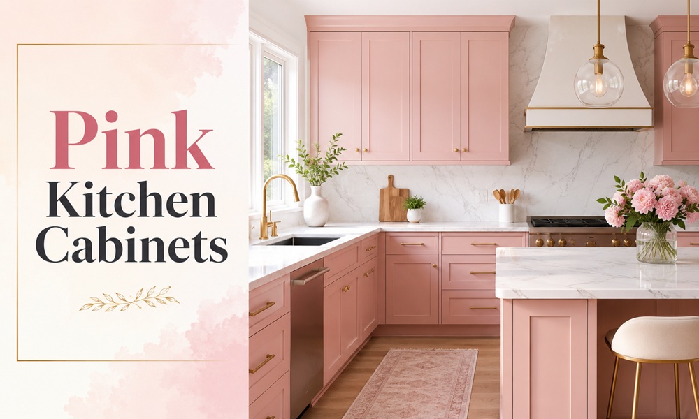
Pink is the only kitchen colour that people apologise for before they install it.
They shouldn’t. Done with the right undertone, pink cabinetry reads as a warm neutral — closer to plaster, clay and terracotta than to bubblegum. Designers have been quietly using it in serious kitchens for years, usually calling it something else.
This guide is organised by shade family, because that’s how the decision actually gets made. Get the undertone right and everything downstream — countertop, hardware, floor — falls into place.
Why Are Pink Kitchen Cabinets Suddenly Everywhere?
Two shifts collided.
The first is the retreat from grey. Designers report clear fatigue with the cool, flat greys that defined modern kitchens; homeowners are moving away from them toward warmer, more expressive direction. Colour trends now focus on earthy tones, inviting colourways and warmer hues — homeowners no longer want the sad beige aesthetic or the all-white modern kitchen.
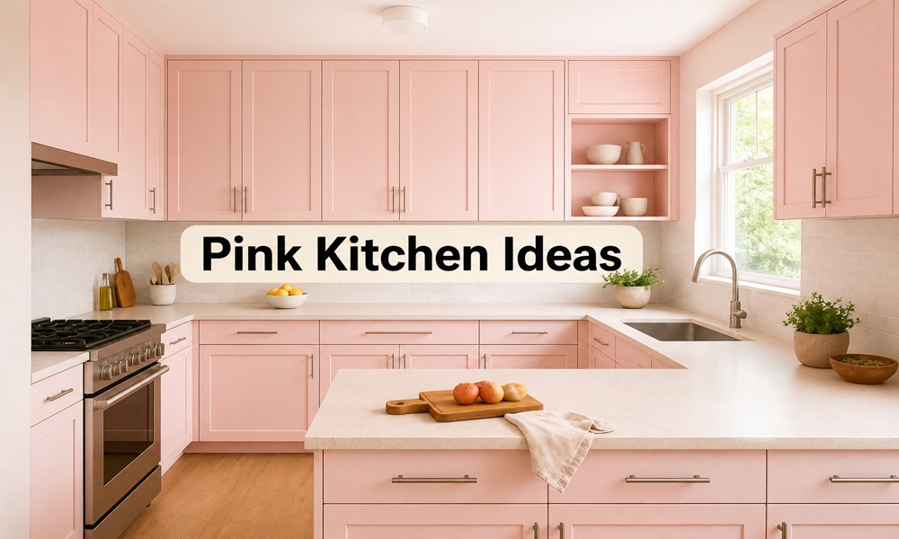
The second is that pink stopped being read as “girly” and started being read as “plaster.” Blush pink, light blue, seafoam green and other muted pastels are soft, fun and inviting — a top choice for vintage, coastal or modern kitchens, styled with a chic feel. Blush pairs elegantly with light natural wood finishes, chrome hardware and subway tile.
And pink now appears in high-end schemes as a supporting colour: deep red cabinets paired with pale pink walls, proving dark cabinets don’t have to mean a dark kitchen. For a softer kitchen scheme, deep red hues look beautiful combined with subtle pink tones.
What Are the Different Types of Pink for Kitchen Cabinets?
Every pink sits somewhere on a warm-to-cool axis. That axis is the whole game.
| Family | Undertone | Reads as | Best light | Risk |
|---|---|---|---|---|
| Plaster pink | Yellow / peach | A warm neutral | Any | Almost none |
| Dusty rose | Grey / brown | Muted, historic | North-facing | Can go muddy |
| Blush | Clean pink | Soft, modern | South-facing | Can go sweet |
| Mauve / sulking pink | Purple | Moody, editorial | Low light | Can go cold |
| Terracotta pink | Orange | Earthy, Mediterranean | Warm light | Can go peach |
| Hot pink | Blue-red | Deliberate, loud | Anywhere with white | Fatigues fast |
Rule 1 — Yellow Pigment Is Your Friend
The pinks that survive daily kitchen use nearly all contain yellow. Farrow & Ball’s Setting Plaster is named after the blushing walls of newly plastered houses. It is a pink in historic terms, but has a certain softness thanks to the inclusion of yellow pigment.
Setting Plaster is a warm, earthy pink with orange undertones, light enough to keep a space bright but with plenty of pigment.
Rule 2 — Grey Pigment Makes Pink Grown-Up
Sherwin-Williams Pink Shadow has a touch of grey that makes it soft and subtle — a more sophisticated hue. Farrow & Ball Calamine gets a light touch of grey that prevents the pink from becoming too sugary, giving a fresher finish.
Rule 3 — Purple Pigment Makes Pink Interesting
Sulking Room Pink tends to sway toward the mauve side. Peignoir is created by giving the softest of pinks a large dose of grey, producing a unique depth. Peignoir has an ethereal quality — you don’t know if it’s blush, lilac, white or grey. It changes a lot with light. Designers use it on walls, millwork and increasingly on kitchen cabinetry.
Which Pink Paint Colours Actually Work on Kitchen Cabinets?
The shortlist, organised by how they behave rather than by brand.
The Plaster Pinks (Safest Entry Point)
| Colour | Brand | Character |
|---|---|---|
| Setting Plaster No. 231 | Farrow & Ball | Dusty pink with peach undertones; timeless and historic |
| Pink Ground No. 202 | Farrow & Ball | Large dose of yellow pigment; the softest blush that doesn’t feel sugary |
| Boudoir | Benjamin Moore | Very similar to Setting Plaster but leans slightly more orange/yellow |
| Crossroads | Benjamin Moore | A hint more pink than Setting Plaster, a touch less grey |
| Likeable Sand | Sherwin-Williams | Darker, pinker and less grey than Setting Plaster |
| Classic Sand | Sherwin-Williams | One of the closest Setting Plaster matches |
Designer note: Zoe Feldman uses Setting Plaster on cabinetry specifically because it works so well there, and would also use it anywhere with a jewel-box quality or lots of millwork.
The Grey-Pinks (Sophisticated, Low-Risk)
| Colour | Brand | Character |
|---|---|---|
| Calamine No. 230 | Farrow & Ball | Soothing pale pink with a touch of grey; more intense in small rooms |
| Peignoir No. 286 | Farrow & Ball | Grey-pink with romantic depth; reads as a neutral |
| Pink Shadow | Sherwin-Williams | Softened by grey; sophisticated enough not to outgrow |
| First Light 2102-70 | Benjamin Moore | Almost weightless brownish-pink |
The Deep Pinks (Statement Cabinetry)
| Colour | Brand | Character |
|---|---|---|
| Sulking Room Pink | Farrow & Ball | Mauve-leaning; a risk worth taking if you’re committed |
| Smoked Trout | Farrow & Ball | Saturated, rich pink neutral; vibrant without overpowering; contrasts beautifully against white or off-white trim |
| Dead Salmon | Farrow & Ball | Beige undertones; a calm neutral for the pink-hesitant |
| Malted Milk | Sherwin-Williams | Warm, elegant, romantic |
| Mellow Coral | Sherwin-Williams | Subdued creamy coral with peachy undertones |
The Whisper Pinks (Reads as White Until It Doesn’t)
| Colour | Brand | Character |
|---|---|---|
| Dimity | Farrow & Ball | A very light warm pinkish white; will look white next to a true pink |
| White Dogwood | Sherwin-Williams | Soft, feminine blush |
| Pink Cloud | Benjamin Moore | Ballet-slipper pink; the lightest of the family |
Real-world proof: One documented kitchen used Setting Plaster on walls paired with cool Carrara marble counters, with cabinets in Dimity — a very light warm pinkish white that read as plain white beside the deeper pink.
How Do You Pair Pink Cabinets With Everything Else?
This is where most pink kitchens succeed or collapse.
The Pairing Table
| Element | Works | Avoid |
|---|---|---|
| Countertop | Carrara, honed marble, black granite, walnut butcher block | Speckled brown granite, orange-toned quartz |
| Hardware | Brushed brass, aged brass, unlacquered brass, matte black, chrome | Polished nickel on warm pinks (goes cold) |
| Wall colour | Creamy white, warm off-white, soft green, muted blue | Overly creamy whites, which look dingy beside plaster pinks |
| Backsplash | Zellige, subway, checkerboard, hand-glazed square tile | High-gloss white with blue undertone |
| Floor | White oak, terracotta, terrazzo, black-and-white check | Grey LVP |
| Accent colour | Deep red, burgundy, forest green, chocolate brown | Bright yellow |
The Pairing Cheat Sheet from Designers
Pair pink and deep red tones with creamy whites, a neutral paint with a pink tone such as Farrow & Ball Oxford Stone, and walnut or natural stone like black granite or marble — it keeps the look timeless and easy to live with.
Muted tans and greys with green undertones provide subtle contrast with plaster pinks and cool down the rich warm tones — consider a warm grey with green undertones such as Benjamin Moore Chelsea Gray on cabinets.
For ceilings and trim, clean whites and off-whites work best: Benjamin Moore Chantilly Lace, Oxford White or Cloud White. Flat sheen on the ceiling, satin or semi-gloss on trim.
The Mistake Almost Everyone Makes
Too many pastels in one room. If you have too many pastel colours together, the combination can end up looking like an Easter egg — and not in a good way. Pick mid-toned rich colours to pair with plaster pink instead.
Yellows can look discordant if they are too light.
Where Should You Put the Pink?
Full pink kitchens are rare in professional work. Partial pink is everywhere.
Colour is being used more intentionally now — a statement island or the lower cabinetry rather than the whole room, layered with warm woods, soft neutrals and aged metals.
| Approach | Effect | Commitment |
|---|---|---|
| Island only | Focal point; easiest to undo | Low |
| Lower cabinets only, white uppers | High-contrast look; darker below, lighter above | Low |
| Pantry / butler’s pantry | Jewel-box moment | Low |
| Full cabinetry, neutral walls | Confident, editorial | Medium |
| Colour-drenched (cabinets + walls + trim) | Immersive, enveloping | High |
On colour drenching: Use one sheen for all surfaces. Matte works very well — it’s the method Farrow & Ball uses when drenching with their Dead Flat sheen.
Will Pink Kitchen Cabinets Hurt Resale Value?
The honest answer, with the data.
Bright, bold cabinet colours can reduce a home’s selling price — Zillow data cited by real estate professionals puts red cabinets at an average $2,310 reduction. Buyers tend to prefer neutral tones like white, grey and wood finishes that have universal appeal.
But note what that statistic actually measures: saturated, bold colour. Not plaster pink.
Two counterweights from the design side:
“I’ll probably never say ‘don’t ever use X colour,'” one design professional notes, “because we have to look at context.” If the home’s architecture supports the colour, it gets a pass.
“If you’re looking to sell, that’s when you look at what appeals to most people. But if you’re making it your home, don’t just do what everyone else is doing. Do what you like and makes you happy.”
The Cabinet Regret Data
Community-reported regret clusters around one specific failure: choosing the shade from a photo instead of a sample.
Turquoise, millennial pink, pastel blue and mint sit near the top of designers’ “never again” list — colours that had a moment which passed quickly. The common issue is undertones and lighting: a colour that looks calm in a showroom can shift dramatically once it wraps an entire kitchen.
One widely discussed Reddit post in r/interiordecorating described repainting cabinets in what was meant to be a soft sage green, only to end up with something bright and lime-toned that clashed with grey counters and stainless appliances. The lesson generalises: cabinet paint regret is common, and it almost always traces back to undertone, not to the colour family.
Cabinet colours cover a huge surface area. Once painted, they dominate the space. Think in palettes, not Pinterest photos — let cabinets support your walls rather than fight them.
The Risk-Adjusted Recommendation
| If you plan to… | Choose |
|---|---|
| Sell within 3 years | Plaster pink or whisper pink, or pink walls with wood cabinets |
| Stay 5–10 years | Grey-pink or dusty rose full cabinetry |
| Stay indefinitely | Whatever makes you happy. Genuinely. |
| Rent the property | Skip pink cabinets; use a pink backsplash or wall instead |
What Do Real Homeowners Say?
Recurring themes across Reddit’s r/interiordecorating and r/HomeImprovement, Quora renovation answers, and first-person Medium renovation diaries:
- Nobody regrets plaster pink. Plenty regret bubblegum. The complaints cluster in clean, high-chroma pinks. Warm, dusty, yellow-based pinks almost never appear in regret threads.
- Sample size matters more than sample colour. Repeated advice: a 12″ × 12″ peel-and-stick sample beats a paint chip; two coats of real paint beats a printed swatch.
- North-facing kitchens turn pink cold. Homeowners in low-light kitchens consistently report their blush going lilac. The fix is a yellow-based pink, not a lighter one.
- The hardware rescue. Several accounts describe rescuing a too-sweet pink kitchen entirely by swapping chrome for aged brass and adding a dark countertop.
- Pre-painted beats DIY on cabinets. Ordering pre-painted cabinet doors saves time and ensures a professional, consistent finish across every door and drawer front.
Practical Execution: Getting the Finish Right
Pink shows brushmarks more than white does, because the eye reads colour variation as texture.
Sheen selection
| Surface | Sheen |
|---|---|
| Cabinet doors and drawer fronts | Satin or semi-gloss |
| Cabinet boxes | Satin |
| Trim and casing | Satin or semi-gloss |
| Walls | Matte or eggshell |
| Ceiling | Flat |
Prep sequence for painting existing cabinets
- Remove doors, drawers and all hardware. Label everything.
- Degrease with TSP substitute — kitchen grease defeats primer.
- Sand to scuff, not to bare wood.
- Bonding primer. For light and mid pinks, use a white or light-tone primer and undercoat.
- Two thin coats. Spray if possible; foam roller plus brush if not.
- Cure before rehanging. Paint is dry in hours and cured in weeks.
Coverage note: Some heavily pigmented pinks cover in two coats even over a mid-tone base, and users report needing less paint than manufacturers estimate.






Comments